The Rack Brochure for Tourist Attractions
Having professionally been in the tourism industry for over 25 years in Florida, I sometimes get asked if there is one thing you would never ever cut from a marketing budget, what would it be? And in the 25 years the answer has been the same: the brochure. If you had to have one printed thing, that would be it. Today, I’d probably opt for keeping a web presence but in the right conditions with the right talent on staff or contract that shouldn’t cost you much so it wouldn’t necessarily have to appear as a large expense once developed.
From the brochure generally flows every message about your attraction (which can be a town, a district, a historic house, a museum, an amusement park or just about anything that attracts people). The brochure is your primary public image and should condense everything you are about into one flat sheet of paper that gets folded in a variety of ways to make the brochure or it could just be a simple 4 x 9 (inches) rack card.

Brochures have been used for many years to attract visitors to attractions such as this vintage Florida Attractions Association map from the mid 20th century.
Get Your Brochure Noticed in the Rack
You’ve seen them. You know what they are. They come in a wide variety of styles. The point is that yours should stand out on the rack and tell prospective visitors what your attraction is about which in turn should entice them to visit. So you have two primary roles for a brochure:
- Have it stand out and get picked up in the rack
- Entice the visitor through photographs or copy to visit
So, take stock in the visitor experience for your attraction or destination. What is it? What are your prospective visitors looking to experience? Figure that out and put it in the brochure. Of course, it is much more complex than just that but in its simplest form, that is really it.

This is a mini-brochure rack. These brochures are small and fit in your wallet and provide just enough information and often a coupon for admission or a discount on a meal.
You will want to invest in some photography. This is critical to any brochure. I once knew a museum that had photographs of all the galleries done for a brochure and they even printed it. When i was asked what could be done about bringing visitors in to it, I started with the brochure. I showed them a very nice brochure promoting the museum. I said that there was one major flaw in it. What is missing in the brochure? Everyone looked and thought perhaps a website, hours, prices, that sort of thing. The answer was people. There were no people in the brochure. Who wants to go to a museum that has no one visiting it?
Then there are those that think a brochure through to the point that it has so much crap in it that it doesn’t do its job. You know the people I’m talking about. You hear them in meetings. They’re the ones who will say “we have to have our prices in there, people want to know.” This person is an operations person and while their advice is nice, prices don’t need to be in a brochure. The job of the brochure is to entice someone to visit. And unless admission is free, it probably isn’t worth mentioning price. And yes, of course, they may call and ask or look on the web. That doesn’t mean you need to promote it in a brochure.
If you can only afford a rack card, by all means it is better than nothing and some people can be enticed to visit with just the information (meaning photographs and copy) in a card. Others may need more images, especially if there is an admission charge. This way they will say “oh, there’s a lot there to do, it must be worth the admission.”
Cover Design is Key for a Brochure to be Picked Up
Another important factor in the rack brochure is the cover. This is how it gets picked up. People see a sea of brochures in a rack and they pick up the ones they’re most interested in. But they really only see the top one third of the cover in a rack. So be sure when designing the brochure that it looks good in a rack and is enticing enough to pick up by your target audience.
Pay careful attention to color in the brochure. If you’re targeting females, remember that over a third of them place orange in their least liked color. And earth tones tend to get lost in a rack. Remember also that you will want to carry out a similar look and feel to any online or printed materials you are doing for the same attraction.
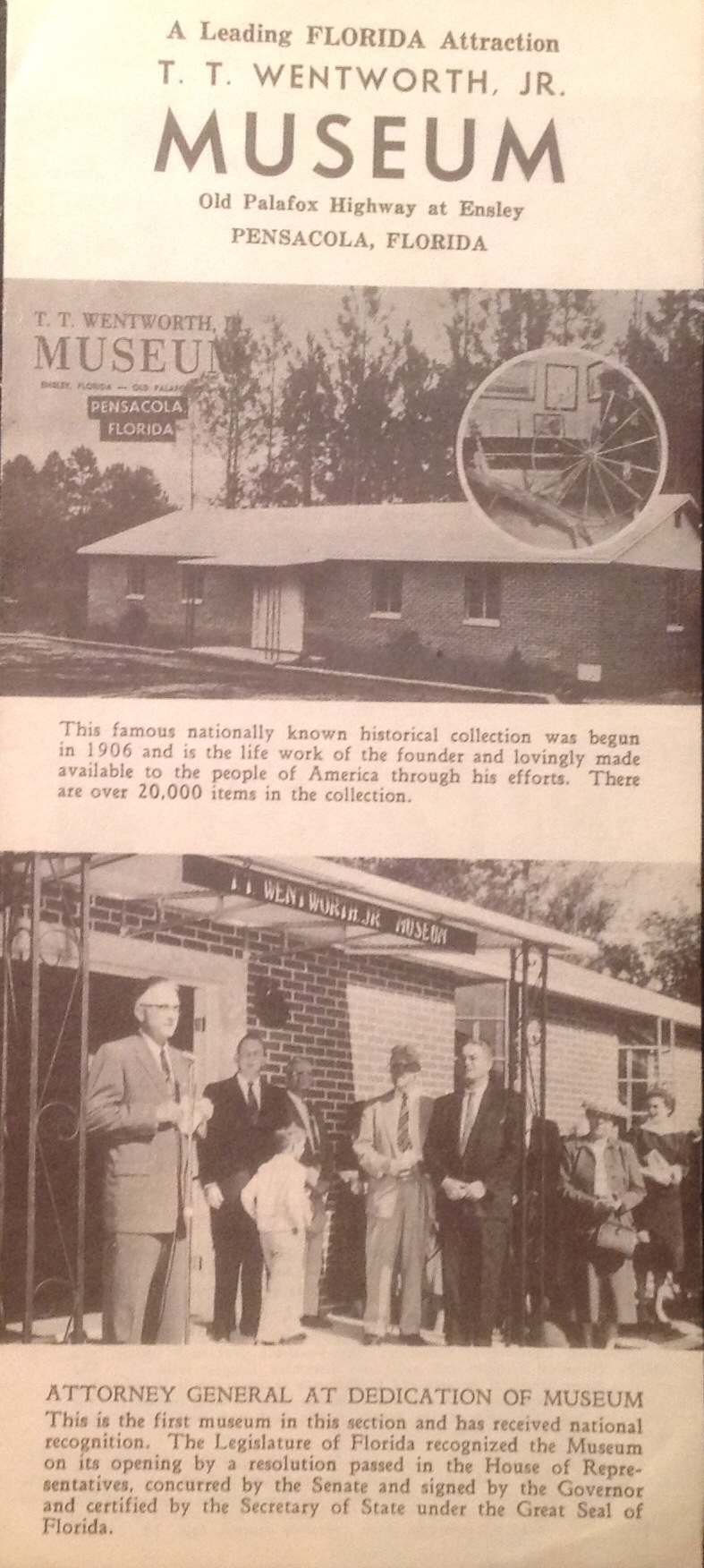
Times have certainly changed when museums printed brochures like this. This is from the T. T. Wentworth Museum in Pensacola from the mid 20th century. Still, the basics of design show the top portion is what is actually seen in a rack.
A simple map that shows how to get to the attraction for key areas that are easy to identify is helpful. Sometimes the most simple thing like “where is it?” comes out of a prospective visitor’s mouth when looking at your brochure. If they can’t figure it out, they won’t be visiting.
So, if you’re working on a marketing plan or a business plan for your non-profit attraction you will want to include a brochure. If you can afford to do an overall branding discovery for your attraction, then some of what you learn there will help you in the brochure design. If not, then this is your key piece so it will become part of your overall branding.
This is part of a series: The Basics of Tourism Marketing for Cultural Attractions
